The high cost of the ‘poetic’ coaching homepage: I abandoned a gorgeous site after 60 seconds of confusion
Key Takeaways: Why your ‘poetic’ headline is costing you bookings
The Problem: Why "aesthetic betrayal" kills trust in 60 seconds.
The Solution: The 3 pillars of a high-converting homepage heading.
The Strategy: How to swap ‘vague’ for ‘clarity’.
The Proof: Before & after rewrites for menopause and career coaches.
The other day I was researching coaching websites in a particular niche. I landed on a beautiful site – great colour palette, clear navigation and a professional image of the practitioner. So far, so good.
Then I read the homepage headline – vague and generic. To make sure this coach was in the niche I was researching, I went in search of more information.
I scrolled past sections of text that had eye-catching backgrounds. I passed more lovely images of the practitioner and skimmed over a couple of testimonials that I didn’t yet have context for.
I was beginning to feel frustrated. And when I finally arrived at the section on services, both of which were unique and interesting, I only felt irritation.
If I’d been an actual customer looking for a coach to work with, I’d have left the site and gone and got a cup of tea and a biscuit. Then I would have looked for a different coach.
The ‘aesthetic betrayal’: Why professional design can’t fix a vague promise
Why did I feel irritated – betrayed even? Because the visually pleasing homepage conveyed care and attention. And so I expected to see that same care and attention when it came to the words on the page.
I don’t doubt the coach spent hours, probably days, coming up with heart-felt, poetic text that left me unclear at to who they helped.
And I get it – I’ve been there – I know how hard it is when you’re so close to your own work. It’s tough to explain clearly what you do especially when, on some level, that poetic language does describe what you do.
But when it comes to booking clients, clarity is the care and attention your potential clients are looking for.
If your website is visually appealing but your website copy is fuzzy, you’ll lose any trust built by having a good-looking site.
And when you don’t have trust, you don’t have bookings.
Why using words like ‘Navigate change’ is the fastest way to lose a potential client
All your website copy needs to be clear – who you help, how you help, what’s the next step (call to action) and what a session with you looks like.
But the main heading on your homepage is often the first text someone sees – and you have a few seconds to communicate who you help and how.
The homepage heading 5-second stranger test
If you want to be understood quickly, before a potential client leaves your site, have a homepage heading that does three things:
Builds trust fast – Stressed, anxious visitors don't have the energy to figure out if you can help them or not. A clear heading tells them ‘you're in the right place’ within seconds.
Helps people self-select out – If you're not for them, that's good to know early. It saves both of you a discovery call that was never going to convert.
Respects their time – No scrolling past good-looking fluff. They get what you do immediately, or they leave quickly.
Translating ‘Unlock your potential’ into a feeling someone can resonate with
For coaches, your headline has to make an emotional connection. Your potential clients need to feel ‘seen’ and understood by you very quickly.
If you’re struggling to think of emotional language for your heading, think about the words your clients use in sessions. How do they explain what they’re going through? What words do they use?
Or if you’re early days and don’t have clients yet, forums like Reddit or Facebook can be a mine of client language, where people struggling with the challenges you help solve hang out. ‘Listen in’ and see what words they use to describe what they’re going through.
And when you think you’ve finally got a good heading, ask yourself – could a stranger read it and immediately know who you help and what changes for them?
From vague to clarity: A rewrite of two coaching headings
Here’s a look at the headline anatomy of a career redundancy coach and a menopause nutrition coach.
Menopause nutrition coach
Vague heading: Unlock your potential through menopause
Vague subheading: Holistic support for your next chapter
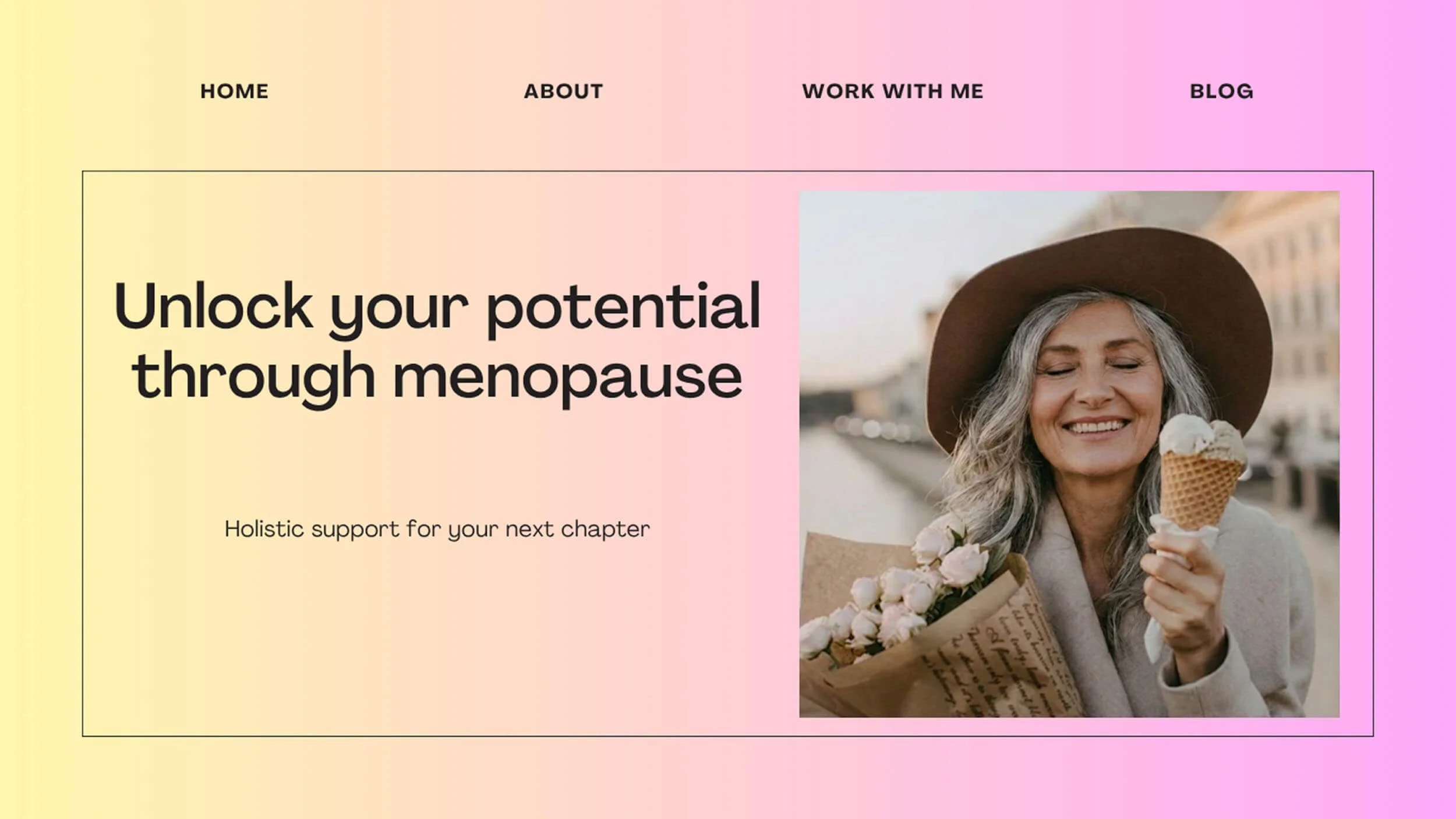
In this example there isn’t a specific, named struggle and we aren’t told what the coach does. This practitioner could be a life coach or equally a yoga teacher.
Clear heading: Brain fog and night sweats don't have to be a given...
Clear subheading: 1:1 nutrition coaching for menopausal women who want their focus and sleep back
The heading gets straight in there with a couple of pain points that women going through the menopause suffer from. This audience will land on the homepage and feel seen and understood.
This combination names two specific symptoms (brain fog and night sweats), names the client (menopausal women), names the method (nutrition) and the outcome (focus and sleep).
Career redundancy coach
Vague heading: Navigate change with confidence
Vague subheading: Coaching for professionals in transition
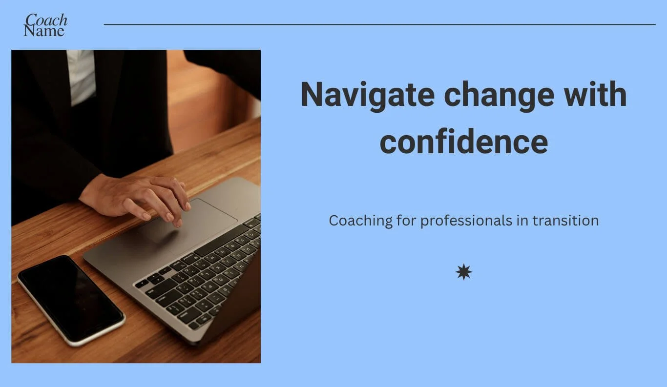
Here we have generic language like ‘navigate change’ and ‘transition’. There’s no clue for the reader about what change the professional may be going through and there’s no emotional hook.
Clear heading: Calm the 3am anxiety that comes with unexpected career change
Clear subheading: Coaching for professionals going through redundancy or a restructure – gain clarity before your next CV lands
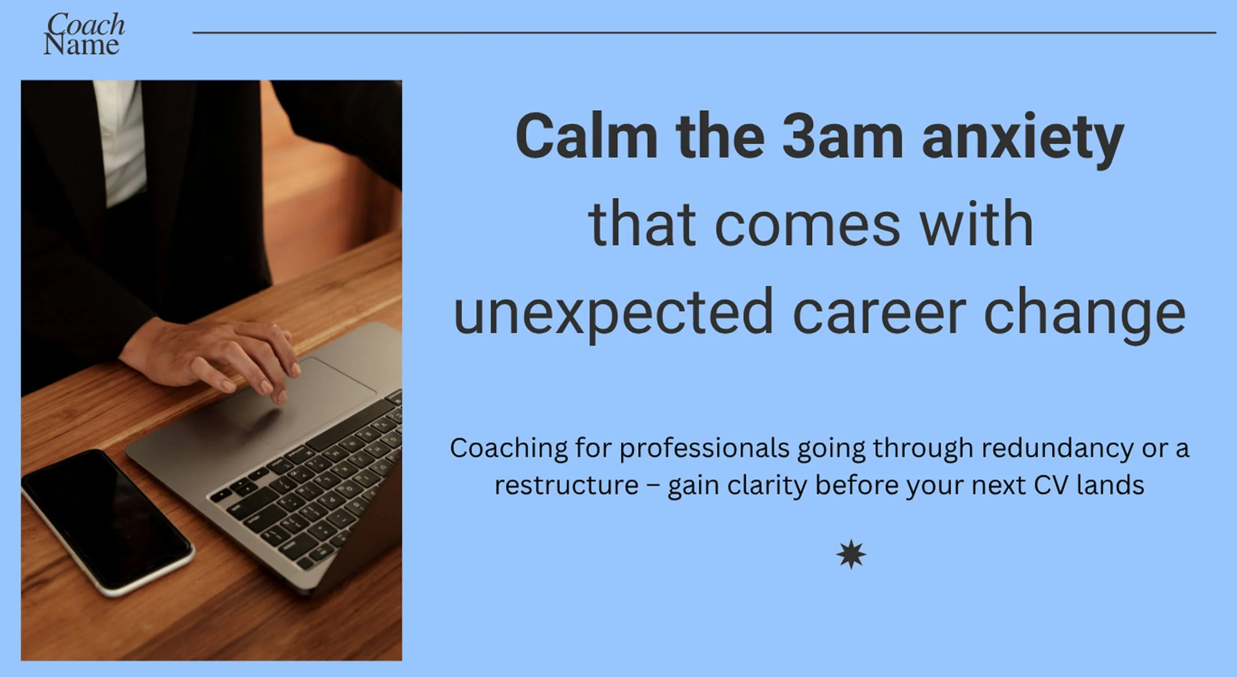
The heading says ‘I know what you’re going through’. This audience can relax a little that someone understands they’re awake at 3am, worrying about what the future holds.
This combination names a specific symptom (3am anxiety), names the client (professionals going through redundancy or restructure), and names the outcome (clarity before your CV lands).
The tragedy of a vague coaching website
Back to that beautiful, confusing site... I think what left me most frustrated was the coach had two genuinely great offers – offers I hadn’t seen anywhere else.
But anyone trying to understand if this coach was a good fit for them would have left long before reaching their great offers. The beautiful site design buttered me up. The vague heading left me unsure. And the services were submerged in a sea of fluff that could only be surfaced by someone willing to do the deep dive.
The real tragedy here is those unique services left on the table that had the potential to make a real difference to someone.
Cover image of a leaking vase originally by Fiona Murray-deGraaff on Unsplash and modified by AI.